One of the most important questions in sensory quality control is simple to ask and hard to answer: how do we know when product flavor is out of spec?
Food and beverage products naturally vary from batch to batch. The goal of QC is not to eliminate every small difference. The goal is to know when a sample has moved outside the product's normal and acceptable sensory range.
P-charts, or percent defect charts, give sensory teams a practical way to track that variation over time.
Why simple quality scales often fall short
Some teams use a quality scale for batch release. Panelists taste a sample, score acceptability, and the team averages the results. If the average is high enough, the batch passes.
That approach is easy, but it can be fragile. Arbitrary scales often collapse into a vague go/no-go decision, and averages can hide important disagreement. A product may barely pass while still showing a pattern that deserves attention.
Why detailed flavor scaling can be too much
On the other end of the spectrum, teams can collect detailed intensity ratings across many flavor attributes. That can be valuable for descriptive analysis, but it may be more work than routine QC needs.
If the practical question is whether a product is true to target, a large attribute-scaling study may slow the process without making the release decision clearer. QC methods should be precise enough to protect quality, but lean enough to run consistently.
What is a p-chart?
A p-chart is a control chart used to track the proportion of observations that are flagged as defective or out of target. In sensory QC, that can mean tracking the percentage of trained panelists who judge a sample as not true to target.
Instead of treating every difference as a crisis, a p-chart shows whether the proportion of not-true-to- target responses is still within the normal range for that product or process.
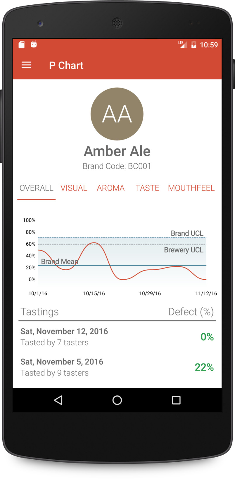
The parts of a sensory p-chart
Useful p-charts usually include a few core elements:
- Completed panel data: each point represents a tasting result, often expressed as the percentage of panelists who selected not true to target.
- Center line: the average defect percentage across historical tastings. This line shifts as more independent data is added.
- Upper control limit: the highest expected defect percentage for normal variation. A sample above this line may deserve investigation.
- Lower control limit: for percent defect data, this is generally zero because defect percentages cannot be negative.
How to build a sensory p-chart workflow
Start with a clear target description for the product. Panelists need to know what true to target means across appearance, aroma, flavor, mouthfeel, and aftertaste before their results can support a control chart.
Then run true-to-target tastings consistently. The old article recommended at least 10 panelists per test and roughly 10 independent batches before relying on brand-specific chart limits. The word independent is important: repeated evaluations of the same batch do not represent normal production variation.
While building product-specific history, some teams use an all-products or all-brands chart as a temporary benchmark. That can be useful, but it should not replace judgment. Product-specific history is stronger once enough data exists.
How to interpret a p-chart result
A sample above the upper control limit means more panelists than usual judged the sample as not true to target. That does not automatically diagnose the problem, but it does tell the team the sample is outside the expected sensory range.
The next step is investigation. Review panel comments, production records, retained samples, raw materials, process changes, and any analytical data that may explain the sensory signal.
Use p-charts to protect normal variation
The power of a p-chart is that it respects normal product variation while still flagging unusual results. That makes it a better fit for routine QC than methods that only ask whether two samples are different.
For teams managing batch-to-batch variation, quality-control tasting, panel training, and structured sensory software can help connect panel data to clear release decisions.
Reference
Nelson, L. 1984. The Shewhart control chart: tests for special causes. Journal of Quality Technology.